LE BOW WOW
Project Type:
Branding
Art Direction:
Kelly A. Holohan
This project is to creact a virtual restaurant that fit in a specific place. We visited the Navy Yard at the beginning of the semester to conduct research. The Navy Yard was an important “war factory”, but now it has become a mixed-use campus mostly for business use. During the visit, I learned that the employees at URBN are allowed to bring their dogs to the workplace, and there are plenty of place for them to take a walk with their dogs, like the broad street run. This is a perfect place for dogs, and a dog restaurant idea come out from my mind.
EXTERIOR
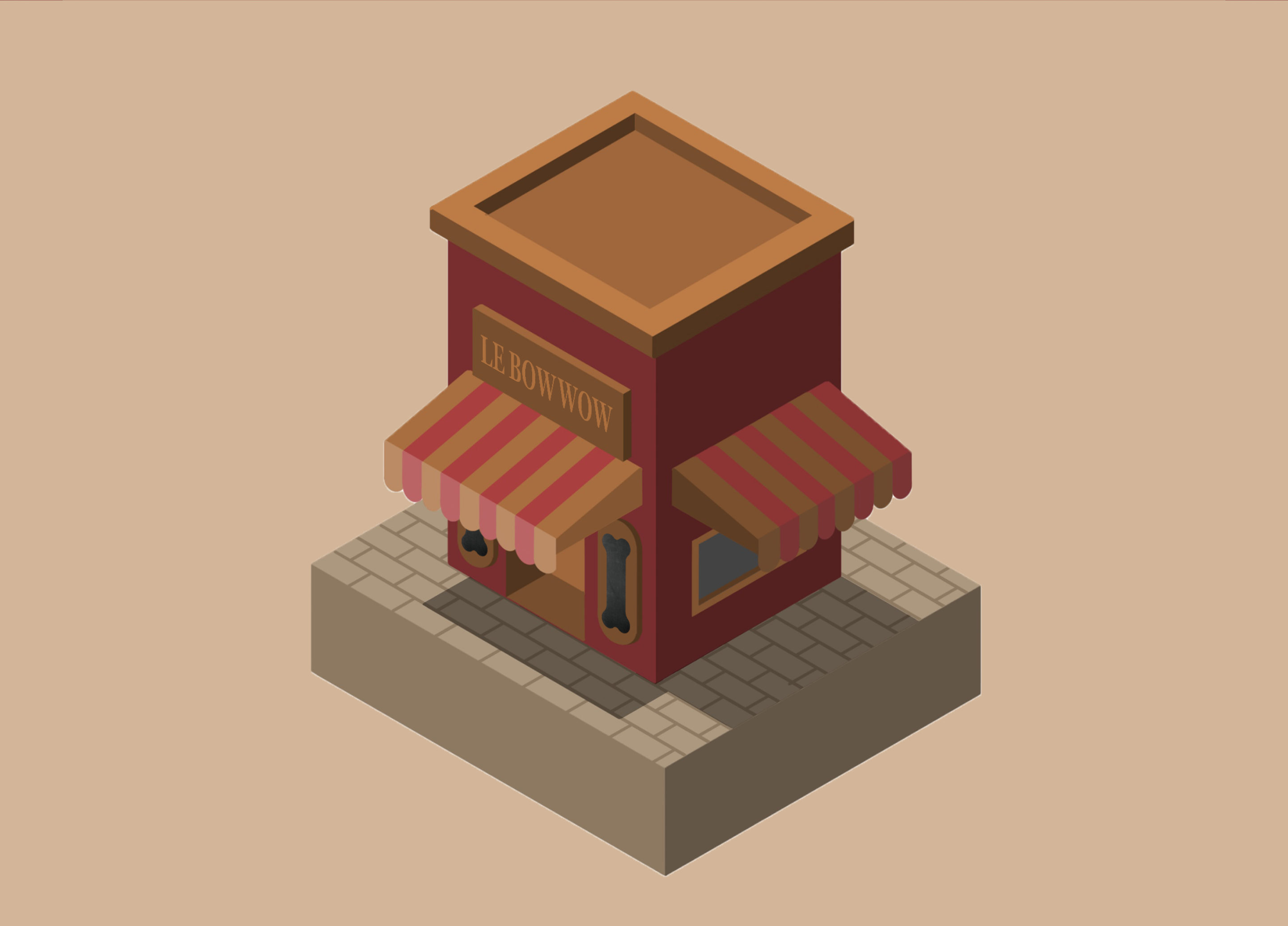
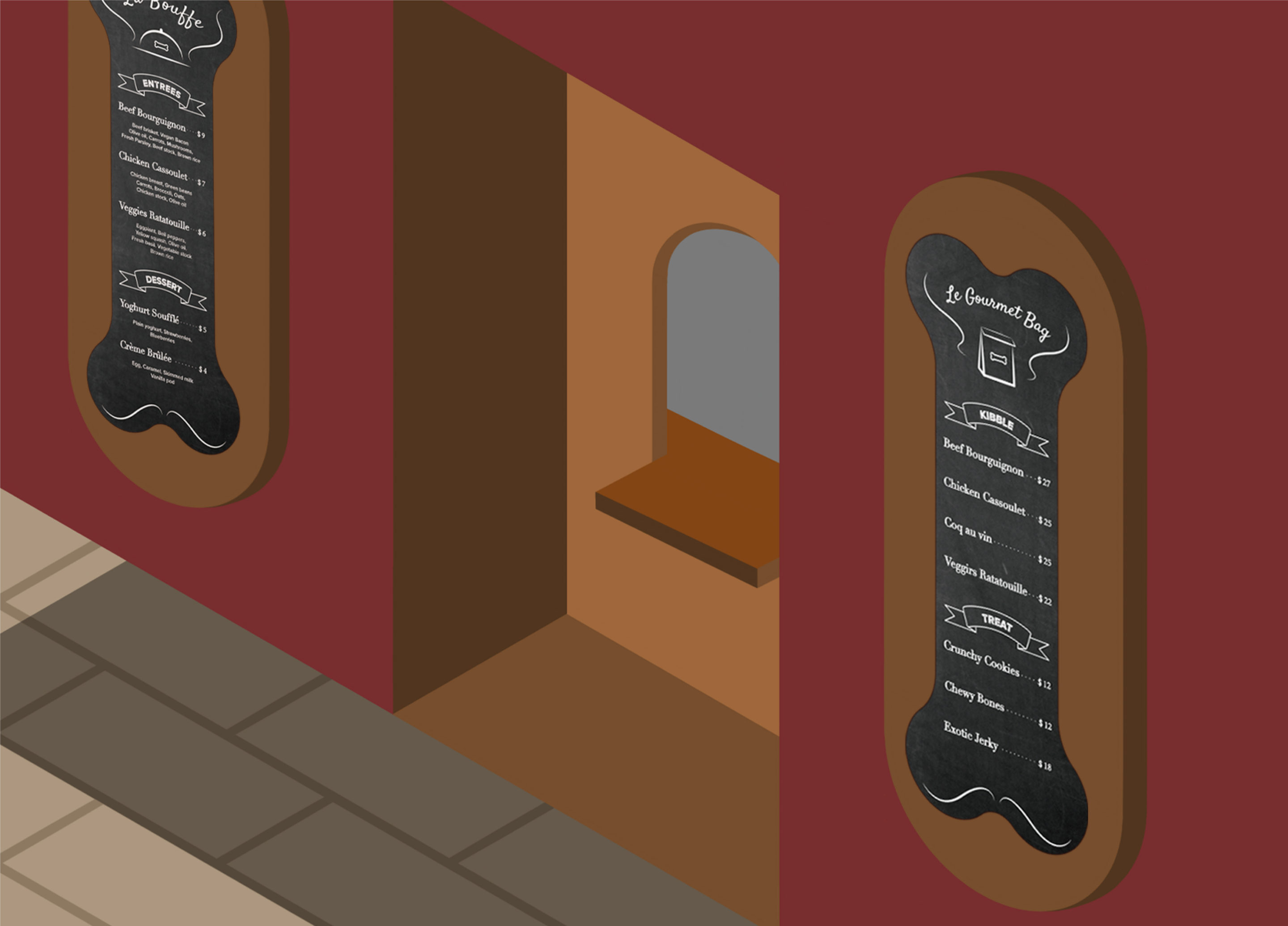
The appearance of the restaurant exterior was inspired by traditional French restaurants, and designed the pop-up to look like a small French café, with two chalkboards menus on the outside wall.
MENU
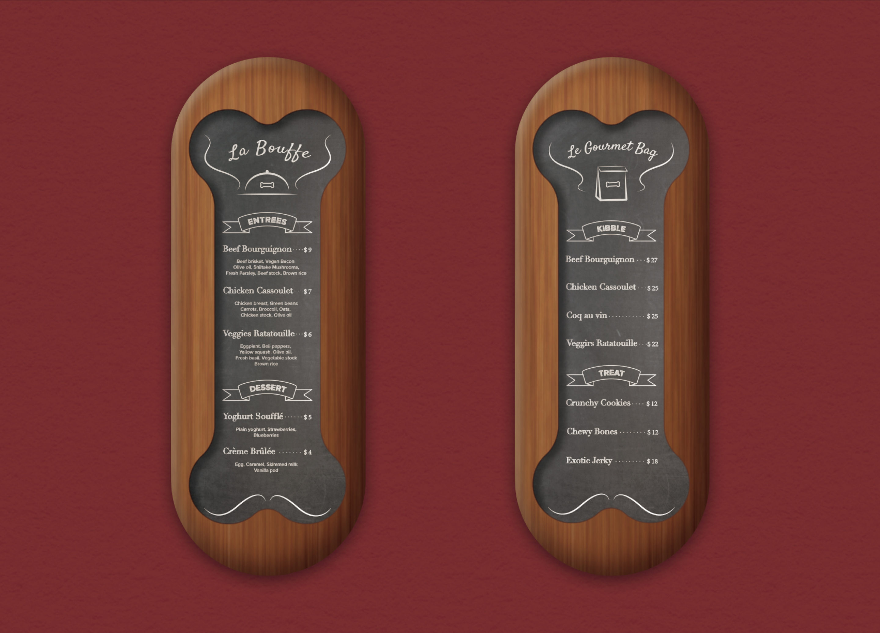
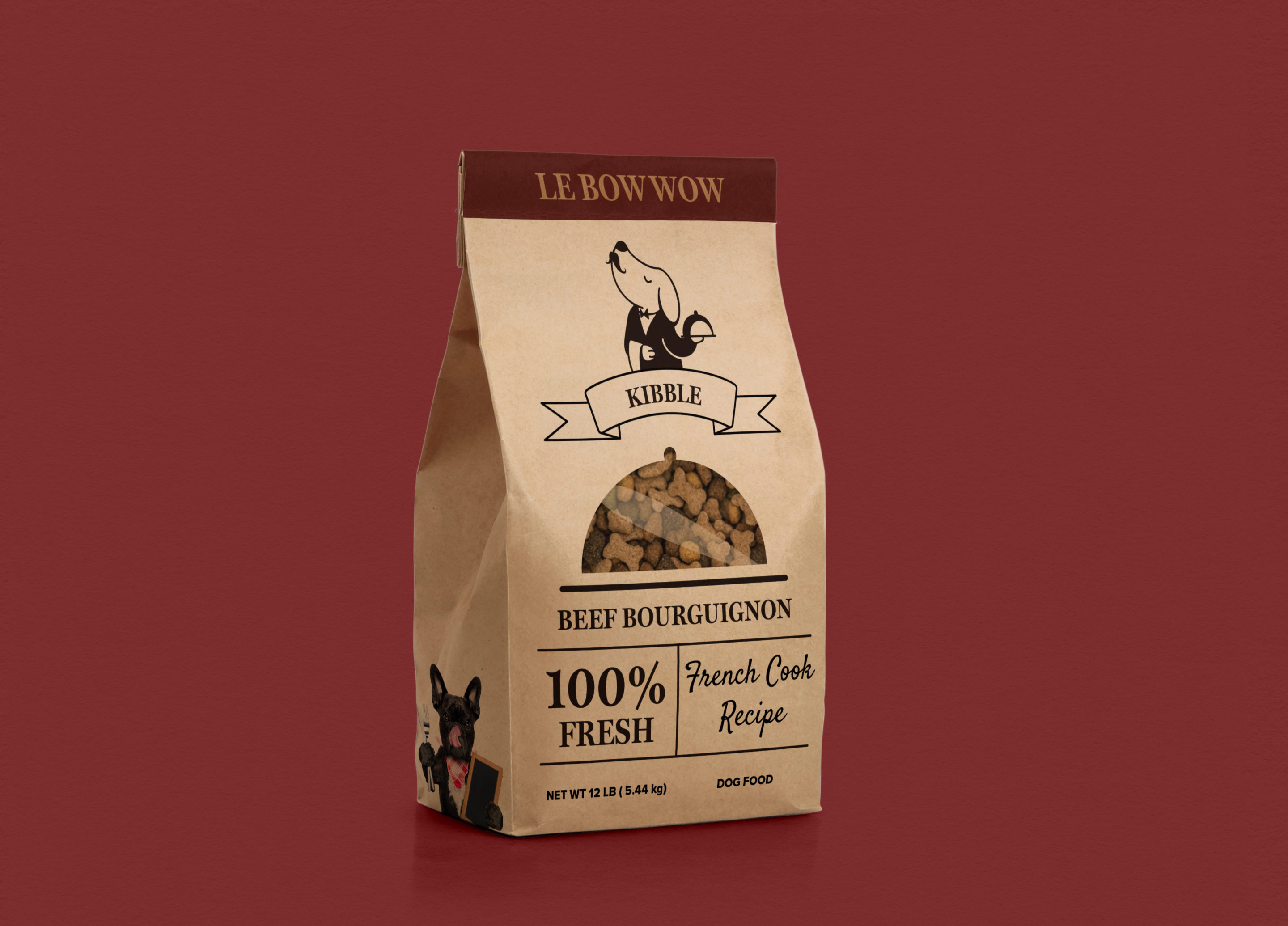
he two menus titled with “La Bouffe” and “Le Gourmet Bag”. “La Bouffe” means to get a quick bite to eat in France. And “Le Gourmet Bag” means the doggy bag that represents the take out menu. For the menu materials, chalkboard menus are very common in French restaurants. I made the shape of the chalkboard look like a bone, and created names that were based on common French dishes, such as chicken cassoulet and beef bourguignon.
DELIVERABLES
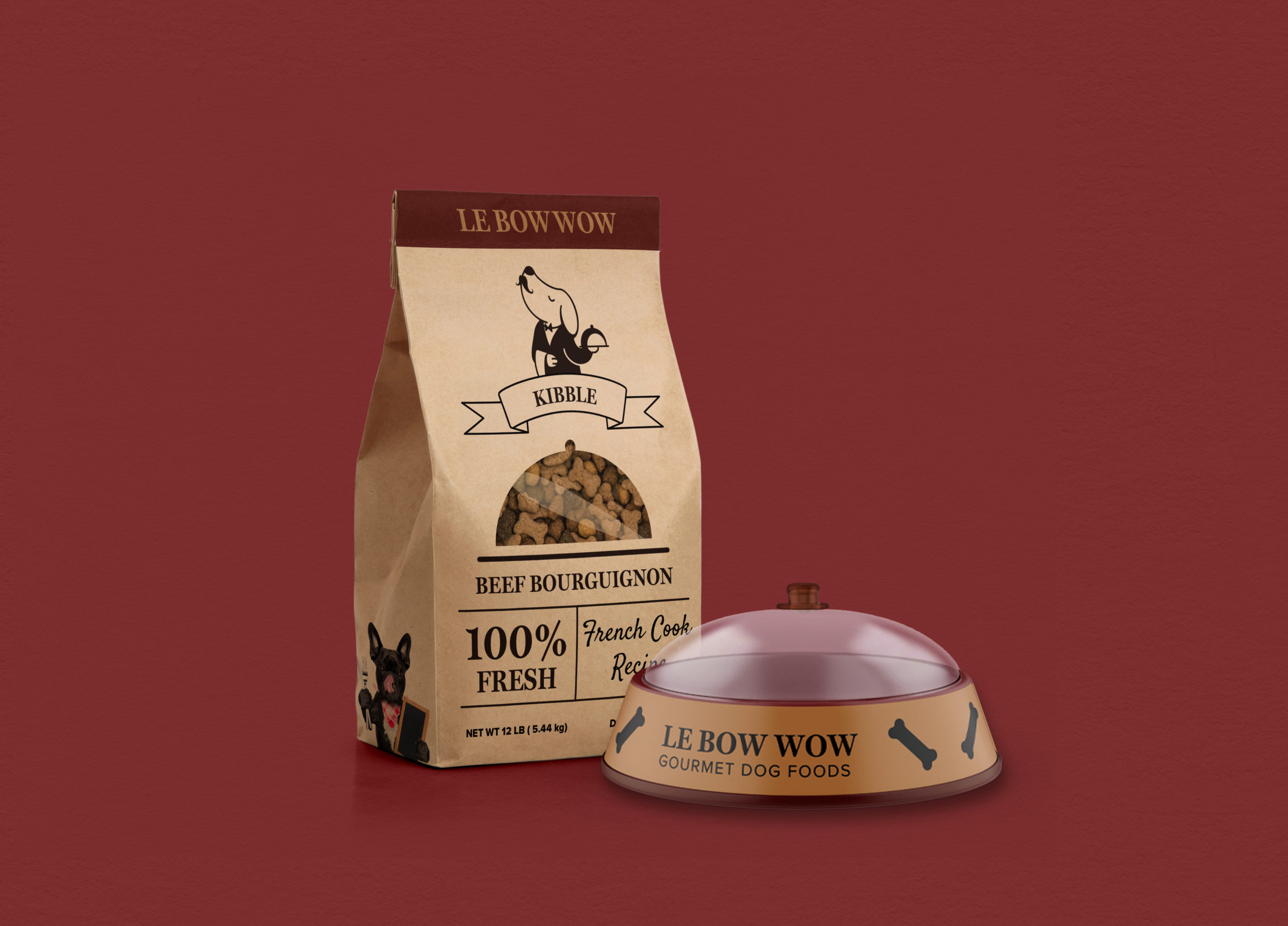
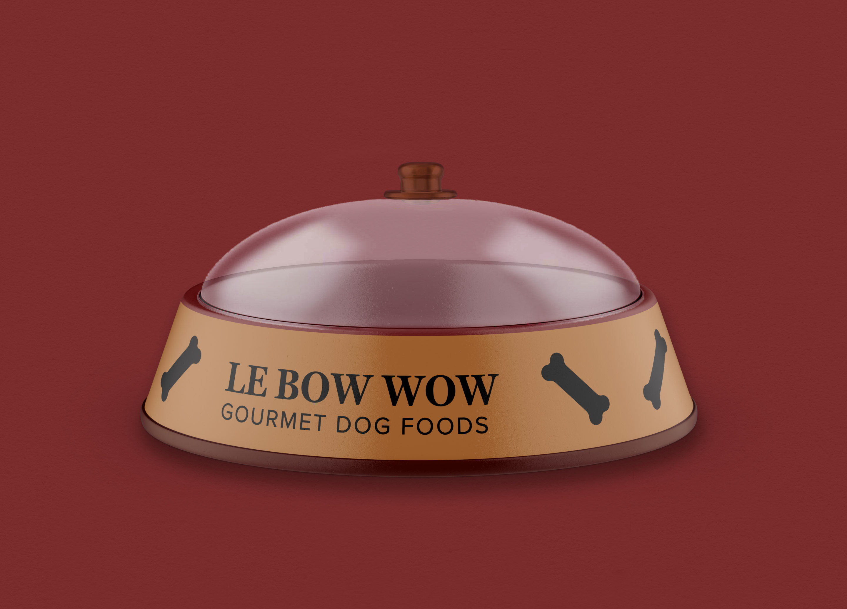
The restaurant have two choices as deliverable. One is traditional packaging for dry dog food take out, and the other is a pet bowl that would be used when dogs eat in. The design for bowl is relatively simple, a pet bowl with a lid that emphasizes the fancy feeling, and match with the idea: “selling fancy dog food in human’s quality”. For the packaging, I choose kraft paper bag so that the color of the bag have a classic modern feeling, and match with the other system. The transparent part on the bag is the shape of lid cover, this is to connect with the bowl idea and explain, both the eat in and take out have the same quality.
